Fence 4 All is a family-owned and operated fencing company that needed a strong, reliable brand identity to continue growing within the community. The company prides itself on its customer service and craftsmanship and wanted to ensure these characteristics were the backbone of its new brand identity. The result is a brand that balances the grit and ruggedness of a hard day’s work with the beauty and elegance of an expertly crafted fence.
Fence 4 All
Client: Fence 4 All
SERVICES RENDERED
Visual Identity
Created a memorable logo and the supporting visual identity system to drive brand recognition.
Stationery & Signage
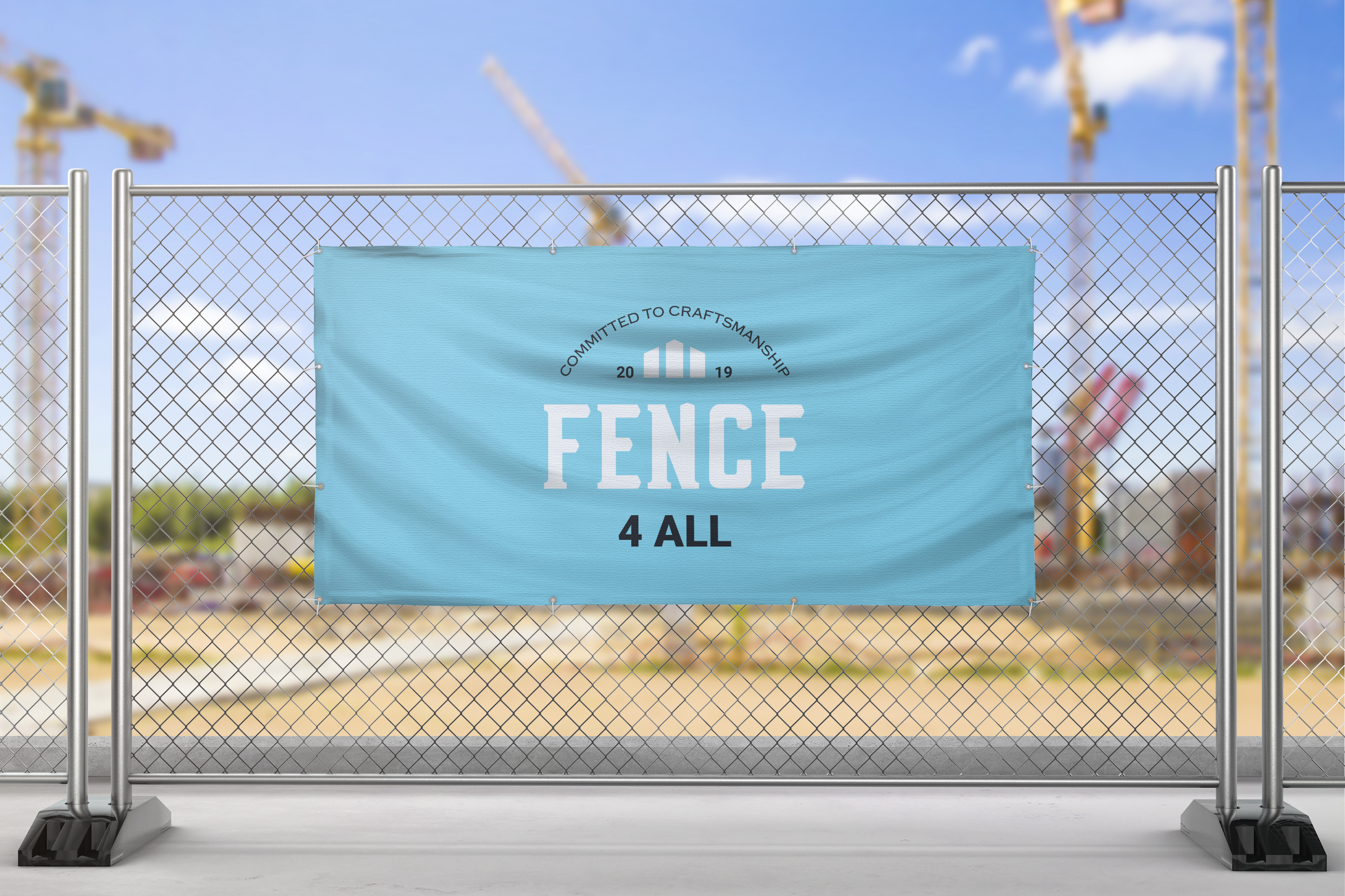
Created a full stationery suite along with outdoor signage to generate brand awareness
Employee Apparel
Designed uniforms that allowed employees to look professional while keeping them comfortable and able to performing their duties.
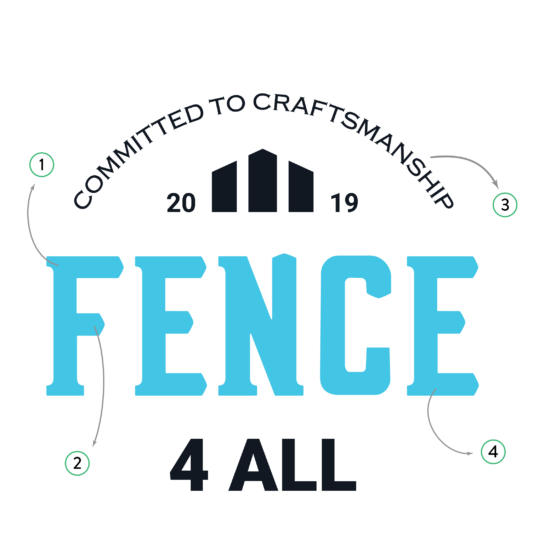
1. Hand-lettered Type
Strong letters with vertical stress represent quality and durability while bracketed serifs add elegance.
2. Pointed Stroke Termilans
Letter terminals resemble fence boards to celebrate the company’s specialty – wooden fences.

3. Slogan
The prominence of the slogan puts the company’s promise to its customers front and center of the brand identity.
4. Bold Color Palette
A bold, bright color palette portrays friendliness and openness, while blue reinforces the brand’s guiding theme of reliability.


